To aid in a more seemless product registration task flow, Bosch power tools set out to create a mobile and desktop web experience that would ultimately drive product registration KPIs higher. In addition to a self-service focus, the team was also tasked with phasing out customers calling on telephones to register their Bosch products.
Role: UX Designer and Usability Tester
Timeline: 6 months
In 2019, Bosch Power Tools struggled with low rates of account creation and product registration, making it harder to gather and use data for product decisions and internal roadmaps.
The client approached Fusion92 with the goal of refreshing the mobile and desktop section of their product registration application. They wanted to know why Bosch users are not registering their products over the mobile and web applications, but instead are choosing to register over the phone.
1. Evaluate existing application
2. Understand Bosch user groups
The current site expect it's users to input too much required information. Furthermore, the experience is made worse by how the information architecture is broken down. A lot of required information is inputted in different pages of the app.

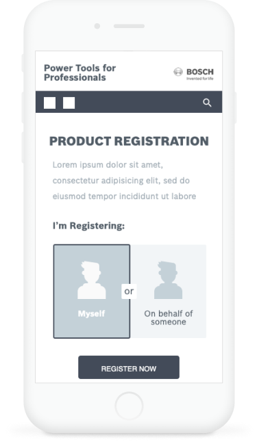
Fig. 1 Breakdown of the Bosch Product Registration task.
People were frustrated by both the amount of information required and the inability to register multiple products at once.
The redesign focused primarily on two personas of the Bosch user base:

Users that are more likely to be using their power tools in more home improvement settings. Budget is important to them as well as brand loyalty.

Users that are less cost conscious and more time sensitive. They use a wide variety of tools from different brands and go the replacement route when the tool breaks.
The solution focuses on streamlining the registration process, mainly taking a look at what information is necessary for the users to effectively register their products. The basis of the prototypes were around removing uneccesary pages, combining multiple page input fields into one.
Testing showed us that it's much easier for people to register if there are only two steps in the registration process. Users also expressed that having a breakdown of registration benefits helped them understand why they should be registering their products.
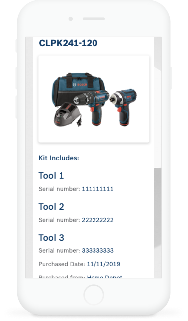
To take things a step further, the addition of QR codes to further enhance the product registration task might be the best way to leverage the mobile capabilities of today's devices.
Although we didn't have access to the concrete numerical figures and statistics, the launch of the product was a success. It is the design and user flow basis for the current Bosch product registration flow.
This is the first project where I was in a leadership role. I definitely learned a lot of new ideas and techniques, but I learned how to lead by example. It's a good feeling having your UX team's back and them having yours. This project definitely changed my outlook as a designer from the perspective of how to evolve your designs to mix well with physical design.
Throughout implementation, we were working with a print designer on how to best implement QR codes and how to best create a digital experience that enhances the physical.The next step in this project is implementation with the developers as well as creating a roadmap of how to tag each product so that they would be filterable. It's too early to tell if this process has lowered physical phone calls, but it helped alleviate some of the pain points most of our users were experiencing during the product registration process.
© 2025 Michael Tan. All rights reserved.