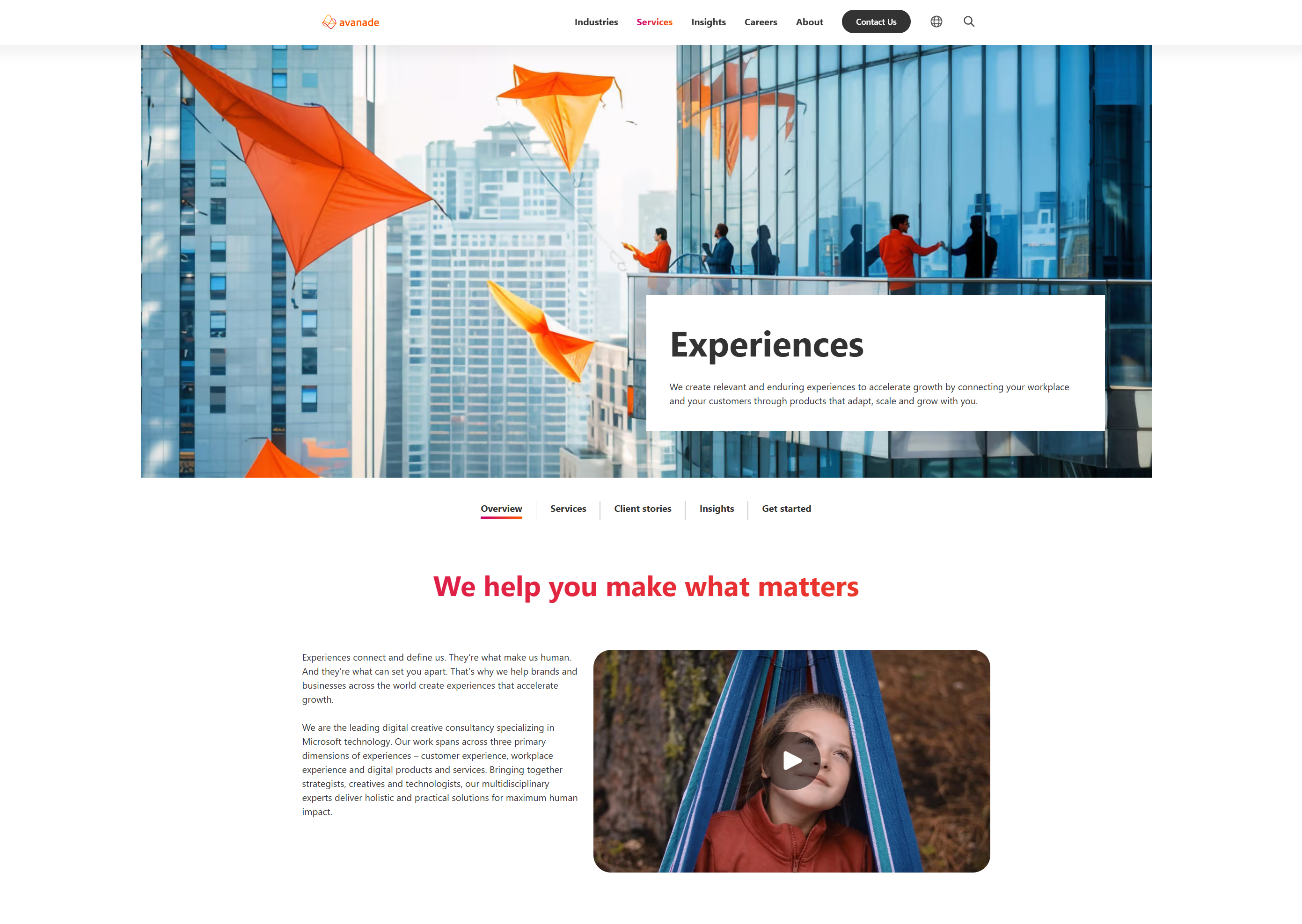
As part of a rebranding and modernizing effort, Avanade stakeholders wanted to re-establish and refresh the digital design system for it's customer facing applications and sites. The completed design system focuses on increased accessibility and usability as well as providing guidelines and documentation that aligns with engineering best practices through token nomenclature and structure.
The resulting design system has allowed Avanade to accelerate the velocity of product development as well as consistency of visual language.
Role: UX Designer and content strategist
Timeline: 6 months
In late 2024, Avanade's design system's lack of aligned governance have caused the component library to become outdated and inaccessible. The largest pain point raised by stakeholders is how it was very inconsistent and very hard to use and implement with engineers
The UX team launched a brand new design system, built from atomic design principles, and with coordination with Avanade engineers to align token nomenclature. The new system focused on governance, consistency and accessibility according to WCAG guidelines.

The project itself was a blank canvas, the team had the opportunity to lead the development of the new design system. My role primarily focused on how the organization and the adaptation of the system would be. I used two principles that served as the guidelines to how the system would be built.
1. It has to be collaborative - The system was built as a result of partnerships between engineering, brand and design team at Avanade. The system itself includes guidelines and walkthroughs for the entire system. The team also put a lot of effort into creating governance guidelines through branching and new component updates.
2. It has to be good design - The design system is built using atomic design principles, but in addition to the design system structure, the team employed tokens and accessibility checkpoints throughout the building of the component library. This enables greater consistency and a faster transition from design to build.
The basis of the structure of the design system is based on token nomenclature and primitives. Through coordination with the engineering team, we aligned the token naming system with a naming system that aligned with how the engineering team labeled their assets.

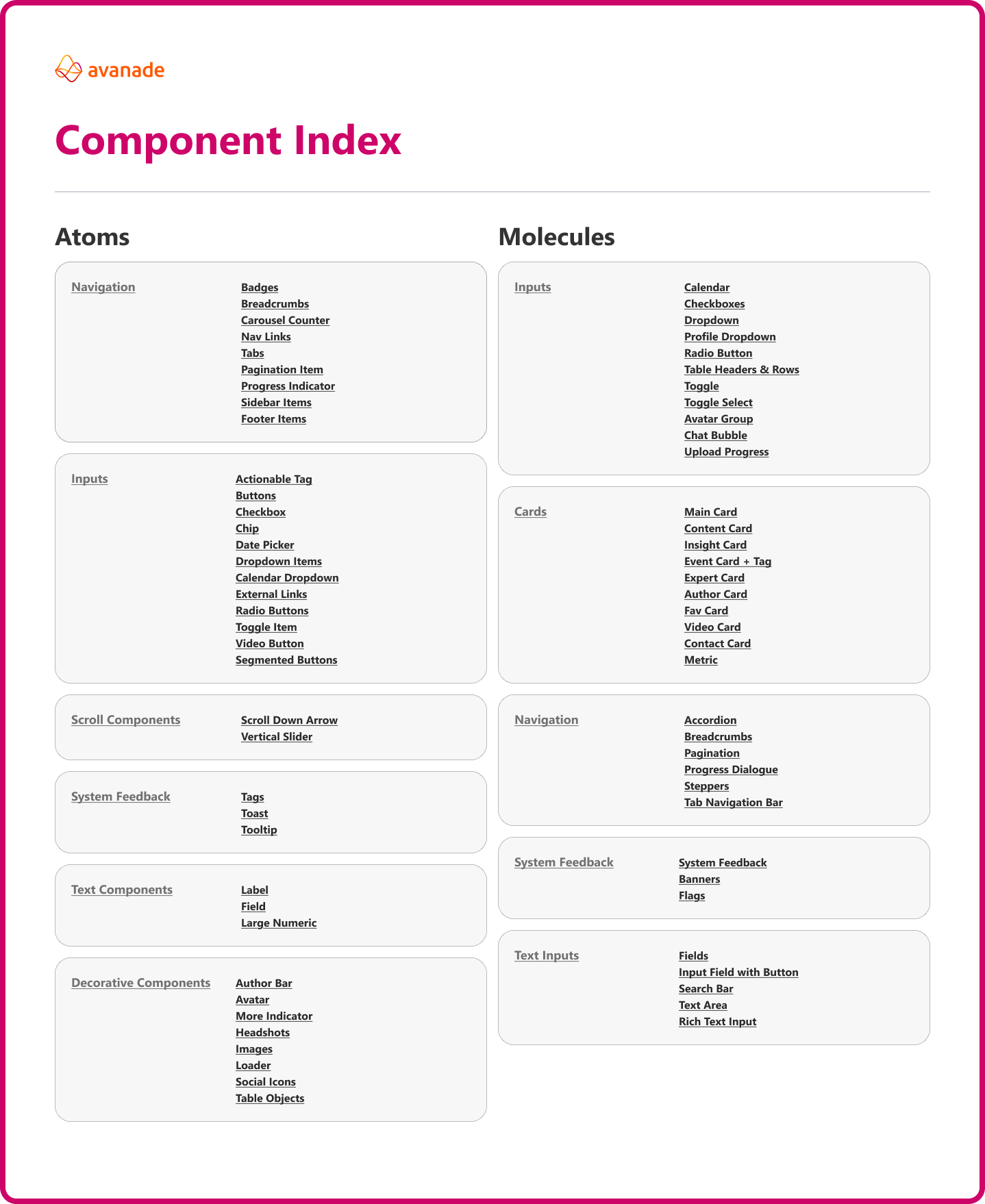
The atomic design principle is very commonplace in the design world but one of the goals of this project was to make it accessible to developers as well. One of the solutions we implemented were guidelines and documentation that explains design principles so that anyone accessing the files can have the required context to use the document more efficiently.
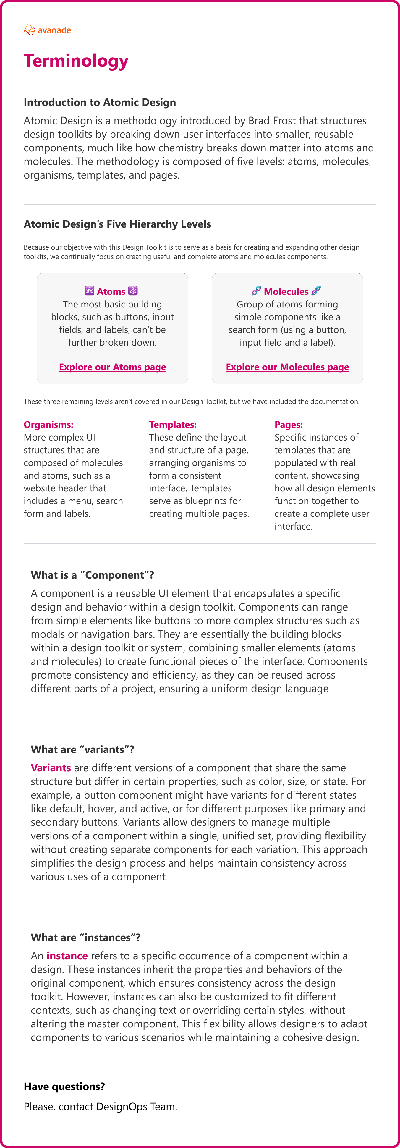
The file contains multiple guidelines so that non-designer users can effectively consume and understand the conepts without requiring designers to do a comprehensive walkthrough of the file.
These guidelines include:
1. Terminology guides
2. Component Indexes
3. Feature Tour
4. Luminosity and Accessibility
5. Branching and updating guides
6. Variables and Variants in Figma
With the focus on collaboration, one of the most integral parts of this system is in how it handled updates, governance and collaboration. I helped establish a form of gathering feedback from both designers and engineers at the company so that all changes are transparent and put in a backlog for future updates.

This is the third design system that I have built from the beginning, but it is the first where my primary focus was on the adaptation, organization and accessibility. What I've learned most in this build is that design systems are not just maintained and created by designers, but by everyone. Collaboration was a huge part in the success of this system and I was excited to see how everyone in the company was invested in how the design system is formulated, created and maintained.
If I had the opportunity, I would have loved the chance to solve how branding can sometimes get in the way of accessibility practices. Through strategic use of the brand colors, we were able to create high contrast screens that aligned with WCAG accessibility guidelines, but there was a lot of pushback for using brand colors in a non accessible way.
What is most apparent to me this time around is how the team built everything according to how style libraries are built in a dev environment. That really helped me foster an understanding of how developers organize and label things. I'm curious to know how this would evolve and if we can see Figma become a viable, no-code option for developers to create live products.
© 2025 Michael Tan. All rights reserved.